Tableau TDA-C01 Tableau Certified Data Analyst Exam Exam Practice Test
Tableau Certified Data Analyst Exam Questions and Answers
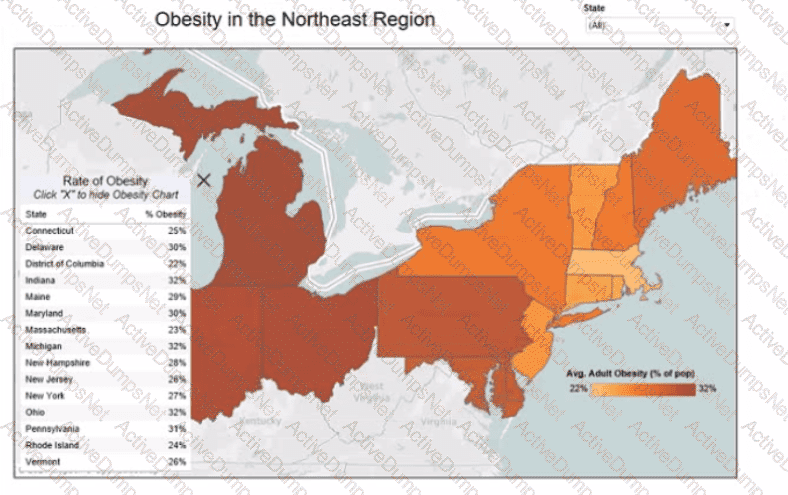
You want to add a comment to March 2020 as shown in the following visualization.
You have the following sets in a Tableau workbook
• Top N Customers
• Customers of 2020
• Top N Products
• Sellers of 2020
Which two sets can you combine? Choose two
You have the following dataset.
Which Level of Detail (LOD) expression should you use to calculate tie grand total of all the regions?
You publish a dashboard tut uses an attract. The extract refreshes every Monday at 10:00.
You need to ensure that the extract also refreshes on the last day of the month at 18:00.
What should you do?
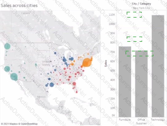
You have the following dashboard.
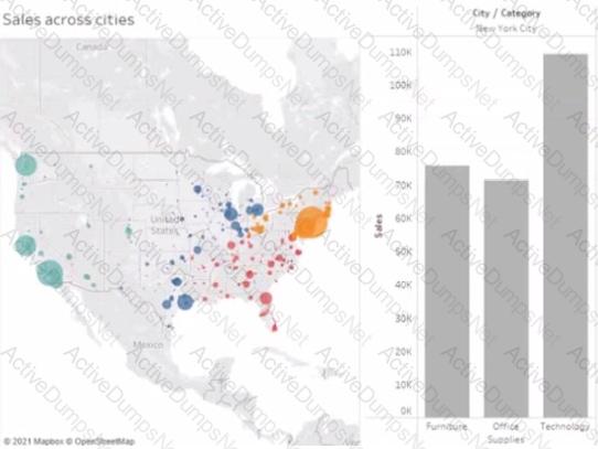
When a user selects a only on the map the data on the bar chart must show only the data for the selected city. The data in the bar chart must change only when the user selects a different city How should you configure the dashboard action? (Use the dropdowns in the Answers Area to select the correct options.)
You have the following line chart that shows the average sales by month.
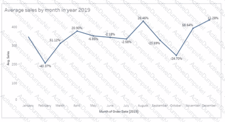
Which month had the biggest increase in swage sales compared to me previous month in 2019?
You want to connect a Tableau workbook to a dataset in a Microsoft Excel spreadsheet.
What should you do from Tableau Desktop?
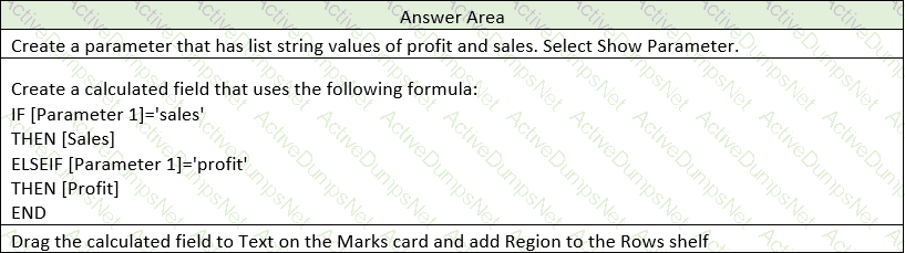
You have the following dataset.
You need to create the following worksheet.
The table must show either profit or sales based on the selection from the Parameter 1 menu.
Which three actions should you perform in orders
(Place the three correct options in order Use the arrows to move Options lo Answer Area Use Answer Area arrows to reorder the options)
 A screenshot of a computer
Description automatically generated
A screenshot of a computer
Description automatically generatedYou have a database that includes field named sales, City and Region.
You have the following chart that shows the number of sales made in different cities.
You want to dynamically show the corresponding region when users hover their mouse over any of the bars.
What should you do?
You are the owner of an alert.
You receive an email notification that the alert was suspended
From where can you resume the suspended alert?
You have the following dataset.
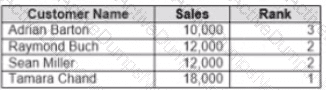
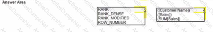
Yon need to calculate the ranking shown in the Rank field.
How should you complete the formula? (Use the dropdowns in the Answer Area to select the correct options to complete the formula ?

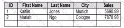
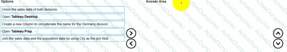
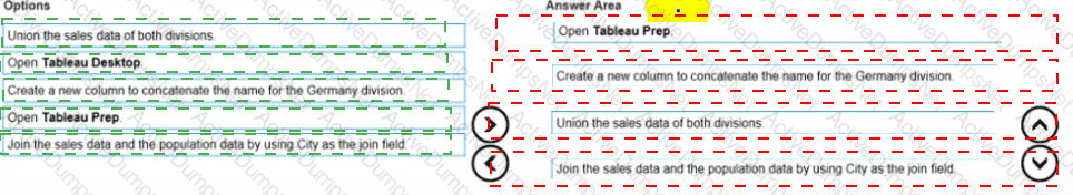
You company has two divisions located in the United States and Germany Bach division has a separate database. The following is a sample of the sales data for the division in the United States.
The following is a sample of the sales data for me division in Germany.
You have population data in a file named Populatio.csv. the following is a sample of the data.
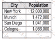
You plan to create a visualization that ml show tie sales per capita for each salesperson Each salesperson must be identified by identified by their full name.
You need to prepare the data to support the planned visualization. The data source must support being published .
Which four actions should you perform in order?
(Place the four correct options n order Use the arrows to move Options to Answer Area arrows to re-order the options.
Use Answer Area arrows to re-order the options)
You have the following dashboard that contains two visualizations.
You want to show only one visualization at time. Users must be able to switch between visualizations.
What should you me?
You have a line chart on a worksheet.
You want to add a comment to March 2020 as shown in the following visualization.
What should you do?
You have the following box plot that shows the distribution of average profits made in every state by region.
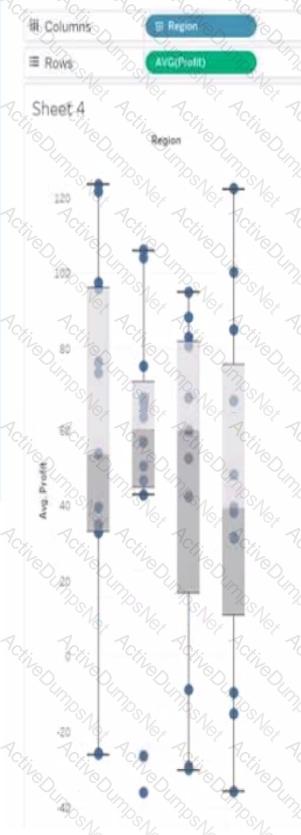
Which region has the smallest distribution of profits?
You have the following tiled dashboard that has one sheet.
You want to replace the sheet with Sheet2.
What should you do?
A colleague provides you with access to a folder that contains the following files:
• Sates.csv
• Bookl.twb
• Sates.hyper
• Export.mdb
Which He contains an extract?
You have the Mowing dashboard.
Which two elements are floating? Choose two.
You have a dashboard that contains confidential information about patients health. The data needs to always be up to date tor a team of healthcare workers How should you share me dashboard with the healthcare workers?
A Data Analyst has the following two tables named Orders and Returns.
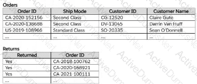
The analyst needs to get the Customer ID and Customer Name for only the orders that were returned. Orders will be the leading table.
Which type of join should the analyst perform in Tableau Prep?
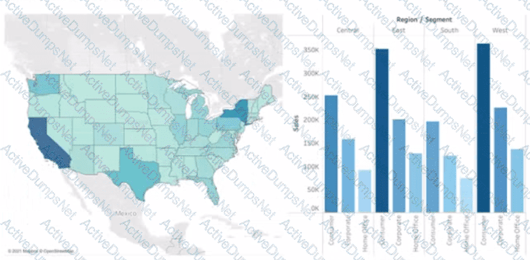
A Data Analyst has the following dashboard.
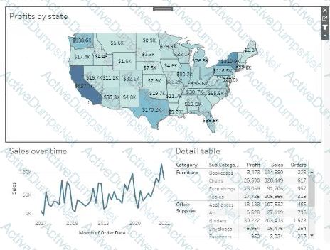
Currently, the map is used as a filter that affects the data on the other sheets of the dashboard.
The analyst needs to configure the dashboard to ensure that selecting a data point on the map only filters the Detail table.
What should the analyst do?
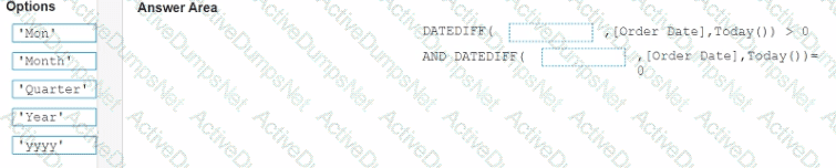
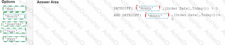
In a worksheet, you have a calculated column named YTD Sales that uses the following formula.
[Order Date] <= TODAY () AND DATETBUNC {“year”, [Order Dace]) = DATETPUNC)"year", TODAY(J)
You want to create a calculated column named Exclude Current Month that will be dragged to the Filters shell. Exclude Current Month will exclude the current month values from YTD Sales.
How should you complete the formula for Exclude Current Month? (Drag the appropriate Options to the Answer Area and drop into the correct locations.)
A Data Analyst at a coffee company has the following visualization already built.
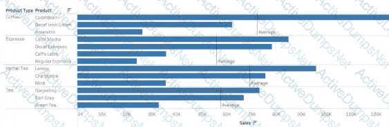
The analyst wants to make this more visually appealing by coloring the bars based on whether they are above or below the Average Sales within each Product Type.
Which calculation should the analyst use to calculate the Average Sales for each Product Type?
A Data Analyst wants to create the following table in a view:
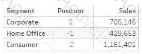
Which function should the analyst use to create the Position column?
A colleague provides a Data Analyst with access to a folder that contains the following files:
Sales.csv
Book1.twb
Sales.hyper
Export.mdb
Which file is a Tableau extract?
You have the following dataset.
Which formula calculates the percent difference in sales relative to the same quarter the previous year as shown in the Calculation field?
You have the following dataset.
You plan to create a dashboard that will be filtered to show only data that is relevant to a specific Tableau user based on the Tableau_User_Name field You need to create a boolean calculated field to place on the data source finer Which formula should you use for the filter?
A Data Analyst has the following chart that shows the sum of sales made in different cities.
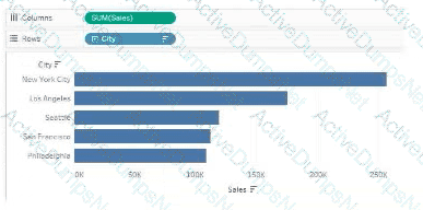
The analyst wants to show the average sale amount for a city when users hover their mouse over any of the bars.
What should the analyst do?
You have the following worksheet.
What should a Data Analyst use to visualize the distribution and variability of measure values along an axis?
You need to change the values of a dimension without creating a new field.
What should you do?
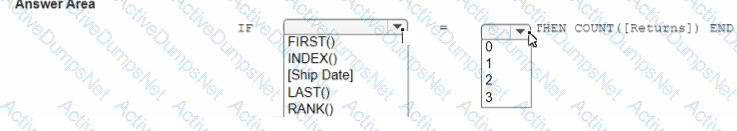
You have the following visualization.
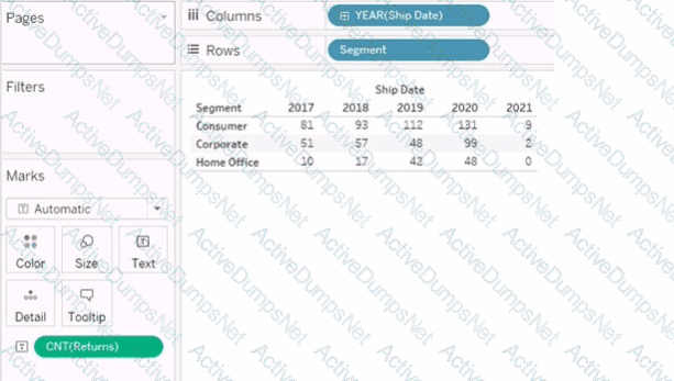
You want the count of Returns displayed only for the first year in the table.
How should you complete the formula in the calculated field? (Use the dropdowns in the Answer Area to select the correct options to complete the formula.)
You have the following visualization.
The Last() calculation is set to compute using Table (across)
Which value will appear in the crosstab for the Consumer segment of the year 2018 if you change compute to use Oder Dale?
A Data Analyst has the following chart that shows the cumulative volume of sales from various dates.
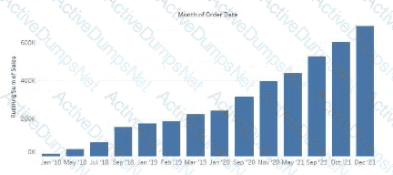
The analyst wants the months to appear as shown in the following chart.
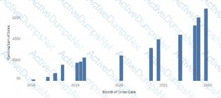
What should the analyst do?
A Data Analyst has a dataset that contains people and the awards they have won.
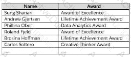
Which formula should the analyst use to get the number of different types of awards that have been won?
You connect to a database server by using Tableau Prep. The database server has a data role named Role1.
You have the following field in the data.
You need to apply the Role1 data role to the Material field.
Which two actions should you perform? Choose two.
A Data Analyst has the following dataset in Microsoft Excel.
The analyst is using Data Interpreter to cleanse the dataset. Data Interpreter provides the following results.
How many rows of data will be ingested into Tableau as values?
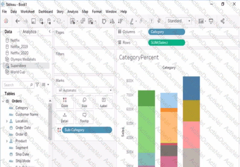
Open the link to Book1 found on the desktop. Open the CategoryPercentage worksheet.
Modify the bar chart show the percentage of sales for each Subcategory within every Category. The total percentage for every Category must be 100%.
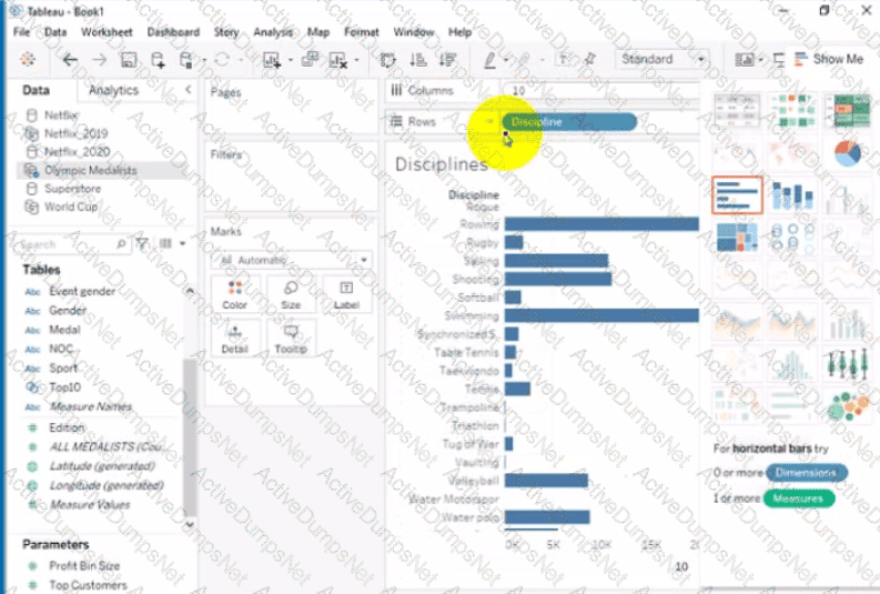
Open the link to Book1 found on the desktop. Open Disciplines worksheet.
Filter the table to show the Top 10 NOC based on the number of medals won.
Open the link to Book1 found on the desktop. Open the Line worksheet.
Modify the chart to show only main and max values of both measures in each region.
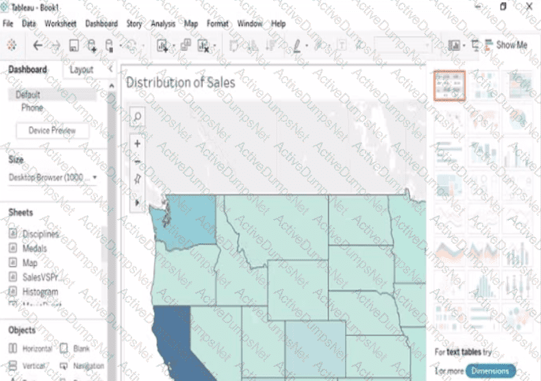
Open the Link to Book1 found on the desktop. Open Map worksheet and use Superstore data source.
Create a filed map to show the distribution of total Sales by State across the United States.
Open the link to Book1 found on the desktop. Open the Movie Durations worksheet.
Replace the existing data source with the Netflix_2019 data source.
Open the link to Book1 found on the desktop. Open Disciplines worksheet.
Filter the table to show the members of the Top10 set and the members of the Bottom10 set. There should be a total of 20 rows.
Open the link to Book1 found on the desktop. Open the sales dashboard.
Add the Sales by State sheet in a Show/Hide button to the right side of the dashboard.
Open the link to Book1 found on the desktop. Use the Superstore data source.
Split the Customer Name field into two fields named First Name and Last Name.
Open the link to Book1 found on the desktop. Open the Histogram worksheet and use the Superstone data source.
Create a histogram on the Quantity field by using bin size of 3.
Open the link to Book1 found on the desktop. Open SalesVSProfit worksheet.
Add a distribution band on Profit to show the standard deviation from- 1 to 1.